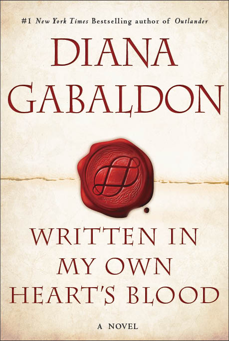
 EW.com (ENTERTAINMENT WEEKLY’s electronic edition) reveals the official cover for MOBY (aka WRITTEN IN MY OWN HEART’S BLOOD), shown above. Here’s the link to their piece, which has a few questions and answers (such as they are [cough]).
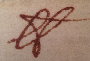
Image at left: From the 1600s, Sir Isaac Newton’s stylized version of the abbreviation “lb,” which was short for the word “libra” in the Roman weight libra pondo, the origin of the octothorpe (#).
While I originally wanted an octopus on the cover—both because I really like octopuses and because of the symbolism (there are eight major characters whose stories I’m telling through this book—and it is the eighth book, after all), there were certain technical issues that made that difficult. My husband—never a big fan of the octopus concept—asked whether I could think laterally; surely there were other ways to get an “8” onto the cover.
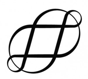
So I thought. And almost at once, the word “octothorpe” sprang to mind. I’ve always liked the word, and it certainly was appropriate (you may or may not recognize it in its Very Artistic form—but it’s the lowly hashtag, or pound sign, #), as it not only has eight points (and eight “fields” of empty space surrounding it; one explanation of its origin is that it was a symbol on old English land documents for a farm surrounded by eight fields), but is a printing character—and the content of the book does indeed have a certain amount about the printer’s trade in colonial America during the Revolution.
 So I went at once to Google and typed in “octothorpe”—and pretty much the first thing I saw was this (the symbol at right). I was so ravished by Conrad Altmann’s beautiful octothorpe that I emailed it at once to my editor, with the suggestion that we use this for the central icon of the new cover design.
Now, frankly, the Art Department was so relieved not to have to deal with any more octopuses that I’m sure they would have fallen on any alternate suggestion with cries of gladness. However, they were as pleased with this lovely octothorpe as I was, and came up with this elegant and striking concept, which I Really Like. Hope you will, too!
Further note: Sir Isaac Newton PRS (25 December 1642 – 20 March 1726/27) was an English mathematician, physicist, astronomer, theologian, and author (described in his time as a “natural philosopher”) who is widely recognized as one of the most influential scientists of all time and was a key figure in the scientific revolution. Image of the symbol written by him above is from the Roy G. Neville Historical Chemical Library, CHF; and Wikipedia.
February 23, 2021: Thank you to Kate Mullin, who pointed out that a web link in a previous version of this blog by Diana was no longer valid, and indeed was erroneously pointing instead to an Asian porn site!
This blog page was last updated on Tuesday, February 23, 2021, at 10:25 a.m. by Diana or Diana’s Webmistress.
It’s a lovely symbol and looks beautiful on the cover!
It is a beautiful cover. I love how your mind works! Very excited for this piece of the story .
It is a lovely cover and I am so excited to see it!! We’re getting closer, right?
Et quand en français ??? Quick, quick, quick please !!!!
The cover is great. I can’t wail for the book to come out. I t isn’t out is it? I’m rather slow in reading and just finished “An Eco In the Bone” Can’t wait for the next book.
Does anyone know that there are a we bit of the first of the book in the Lord John gray’s ebook?
Zombie
Dear Ron–
Well…I’d hope they do. [g] In case not–Ron means that there are excerpts from WRITTEN IN MY OWN HEART’S BLOOD at the end of the ebook, “Plague of Zombies.”
–Diana
This is GENIUS, while be quite lovely at the same time.
Beautiful cover!
Brilliant! Possibly the best symbolic design. Love the look of the seal. Like an important document, sealed with wax and a ring.
I loved! Congratulations, Diana!!
I love the look, it fits with the other books more than an octopus would too. Just sad I have to wait until December, I will be off maternity leave by then!
I also love that it looks like two intertwined or overlapping lemniscates (eternity symbols) which seem beautifully symbol of Jamie and Claire. Lovely!
I didn’t know the word for eternity symbols I love that element to the design. It’s really just very elegant and fitting. It’s so many things in one…. eternity, hashtag, 8′s…perfect!
I thought the exact same thing….the eternal love of Jamie and Claire. So lovely!
Only eight major characters? Jamie, Claire, Roger, Bree, Lord John, Ian, Fergus. What about Wiliam, Jenny, Rebecca, Marsili, Germaine, Amanda, Jemmy. Are these guys not going to have major roles? They certainly influence a lot of what goes on.
She said eight storylines–some of these are pairs… or trios, even… so that does not disclude them from the storytelling
Come on, guys…. It’s not OUR book, it’s hers. Don’t tell her how to write it!!!
I love the symbolism! Another beautiful cover, but I can hardly stand the wait for the release of the book!
I love the cover design! All the elements come together to represent what I imagine the book will be.
I just completed a quilt top titled “Octothorpe.”
Thanks for this comment Diana. I love both, the octothorpe -its meaning – and the cover!!
It’s great! Extraordinarily elegant and extraordinarily creative.
Love it!!!
It’s a beautiful cover! It manages to look ‘new’ while still fitting in with the overall design scheme for the other covers. Can’t wait to see it in person!
Oh Diana!!! Please get this book published this year…….I’ve been looking forward to it SOOOOO long!
What she said
I’m with them! Can’t wait to get it in my hands! But then I’m sad again after I finish it because the wait begins anew! Thanks so much for this series I love it!
Love the idea of using it as the seal…Of course it would be Jamie’s Ruby Ring, yes?!!!
I don’t remember Jamie’s ring having a raised octothorpe in it.
Dear Shari–
It doesn’t. This doesn’t have anything to do with Jamie’s ring.
–Diana
I can just see a group of people huddling together trying to figure out how to put an Ocotopus on the cover, “She wants what?”
Of course, that’s the nice version.
It is a beautiful – but please, please, please, let the soft cover version not be a neon colour. I still can’t get over the green!
It is a beautiful cover. Thanks for sharing it with us.