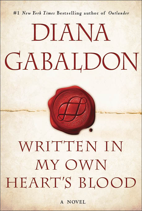
 EW.com (ENTERTAINMENT WEEKLY’s electronic edition) reveals the official cover for MOBY (aka WRITTEN IN MY OWN HEART’S BLOOD), shown above. Here’s the link to their piece, which has a few questions and answers (such as they are [cough]).
Image at left: From the 1600s, Sir Isaac Newton’s stylized version of the abbreviation “lb,” which was short for the word “libra” in the Roman weight libra pondo, the origin of the octothorpe (#).
While I originally wanted an octopus on the cover—both because I really like octopuses and because of the symbolism (there are eight major characters whose stories I’m telling through this book—and it is the eighth book, after all), there were certain technical issues that made that difficult. My husband—never a big fan of the octopus concept—asked whether I could think laterally; surely there were other ways to get an “8” onto the cover.
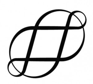
So I thought. And almost at once, the word “octothorpe” sprang to mind. I’ve always liked the word, and it certainly was appropriate (you may or may not recognize it in its Very Artistic form—but it’s the lowly hashtag, or pound sign, #), as it not only has eight points (and eight “fields” of empty space surrounding it; one explanation of its origin is that it was a symbol on old English land documents for a farm surrounded by eight fields), but is a printing character—and the content of the book does indeed have a certain amount about the printer’s trade in colonial America during the Revolution.
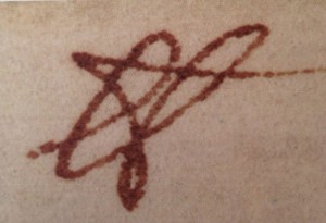
 So I went at once to Google and typed in “octothorpe”—and pretty much the first thing I saw was this (the symbol at right). I was so ravished by Conrad Altmann’s beautiful octothorpe that I emailed it at once to my editor, with the suggestion that we use this for the central icon of the new cover design.
Now, frankly, the Art Department was so relieved not to have to deal with any more octopuses that I’m sure they would have fallen on any alternate suggestion with cries of gladness. However, they were as pleased with this lovely octothorpe as I was, and came up with this elegant and striking concept, which I Really Like. Hope you will, too!
Further note: Sir Isaac Newton PRS (25 December 1642 – 20 March 1726/27) was an English mathematician, physicist, astronomer, theologian, and author (described in his time as a “natural philosopher”) who is widely recognized as one of the most influential scientists of all time and was a key figure in the scientific revolution. Image of the symbol written by him above is from the Roy G. Neville Historical Chemical Library, CHF; and Wikipedia.
February 23, 2021: Thank you to Kate Mullin, who pointed out that a web link in a previous version of this blog by Diana was no longer valid, and indeed was erroneously pointing instead to an Asian porn site!
This blog page was last updated on Tuesday, February 23, 2021, at 10:25 a.m. by Diana or Diana’s Webmistress.
Love this. Very Celtic, eternal, modern – it’s got it all. I love octopuses too, but I’m very glad you didn’t use one on the cover. (g)
Pam
Once again, I’m learning a new word, compliments of Dr. Gabaldon. There are other aspects of this cover that are striking to me. It seems as if there is a “line” across the page, perhaps symbolic of a line that is to be crossed (or not) in some of the story lines. The Octothorpe itself seems to be contained within a drop of blood, with a small droplet splashing outward. Given the use of “blood” within the title, the presence of it on the graphic design of the cover is not surprising.
Every other cover, of the recent issues that is, have been in jewel tone colors, for reasons that relate to the use of jems and what they do, throughout the series. This cover appears to be flesh toned or sand toned to me, with the lettering done in a blood red color. Is this in keeping with the previous book title, “An Echo in the Bone”?
Thank you for more to speculate about in the months before we hold this in our own hands.
Dear Soon–
Um….it’s meant to be a blob (and drop) of red sealing wax, and the line is the fold of paper that it’s sealing. [g] And it’s sort of white/parchment colored, because it’s paper.
–Diana
The tan part of the cover of WIMOH shows a one-page letter with a wax seal, imprinted with the octothrope over the fold line, to make it into an envelope.
Absolutely perfect! Love it. Amazing how things just fall into place isn’t it?
Beautiful, I cannot wait to read this book. I am currently re-reading the previous seven. It has been a long time since I read them. I will look for you next time I am in AZ visiting my family!
Diana, you have managed to make this book remind me of outlander, the look of the front cover is so plain but yet so exquisite. You have made me right from the very beginning of this series to good in search of my Scottish heritage. thank you for all you have done and continue to do……
I love it! However, Almost as enigmatic as the first of your books to beckon me from my library shelf….”Dragonfly in Amber” Can’t wait till December!
I love the cover, Diana. The symbol is beautiful and accomplishes all you had in mind. The wax seal speaks of many attributes of the story as well. Congratulations and looking forward to reading!
Bev
Octothorpe idea is great! Just teasing about your giving in on the octopus. This is really a classy cover. Can’t wait for the book.
PERFECTO!!! , indiscutiblemente perfecto!!
I read on the EW.com piece that MOBY is coming out in December, is this a fact.
Love the cover!! Do you have a release date yet??
Love the cover…then again, in my eyes you can do no wrong! I DO have a question however…and I’m not sure if it’s ever been asked, and if so, answered..but what happened to the “painting” like covers…as in the first 4 books in the series?
It’s perfect! Simple yet not! I’m looking forward to reading the continuing saga and to meeting you in Virginia on April 12th.
An absolutely lovely cover, and the symbolism is great. Besides the “8″ there is also the red color and the similarity to a Celtic love knot showing Jamie & Claire’s never ending love. Great job!
Absolutely love it Diana
Love the cover!!! Can’t wait to hold it in my hands. I have read the entire series through several times and have just finished listening to the audio versions – wonderful. I always pick up details that I missed in previous readings. I read “Leaf on the Wind of All Hallows” last night. What is Paul Rococsky (aka the Comte St. Germain) doing in this book – the 1940s?? Have I missed something along the way? I hope someone out there can clear this up for me.
Thanks again, Diana, for these wonderful books. Every time I try to read something else, I can’t wait to get through it and back to the Outlander series.
“8″ is one of my favorite numbers and my home is designed with octagons and 45 degree angles. Can’t wait for the next adventure. We’re rereading all the previous to keep the rhythm just right.
Fabulous cover and I can hardly wait for Christmas now LOL!
Funny, I thought it was octopi …clearly, I was wrong! Congrats on the 8th installment on this saga that has honestly held my attention for months. I am excited to get to the next book. Thank you for being the prolific writer that you are!
The rule to make the singular ‘-us’ to ‘-i’ is for Latin. The word octopus is of Greek origin.
Dear Amber–
Yep. Hence, “octopodes.” Or “octopuses,” should one happen to be speaking English. [g]
–Diana
oh sad…i had so looked forward to reading it on my honeymoon in October when the release date was Fall 2013 =(
LOVE it!
and I CANNOT wait to get my hands on it!!