September, 2015:
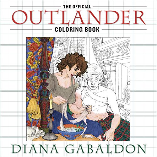
 The Official Outlander Coloring Book just became available for pre-order— and will be released on October 27, 2015— so I wanted to give you a little background and description on it, so you’d know just what it is… and isn’t.
For starters, it’s not a storybook, at all. Not a graphic novel (like THE EXILE), I mean. It’s an "adult coloring book;" the pages are just separate images, for coloring. So it’s not going to tell you anything you don’t already know about the story. (If that’s what you want, allow me to suggest the various novellas that I’ve written, which fill in all sorts of interesting lacunae…)
Well… adult coloring books. Evidently this is now a "thing," with so-called adult coloring books being touted widely as aids to meditation, as well as entertainment. I can kind of see that, and certainly I’ve seen several very beautiful books that look like they’d be interesting to color, if one was so inclined. (NB: The "adult" designation apparently merely means they’re marketed to adults, not that they contain R-rated illustrations. (Frankly, I think they’d be more interesting if they did, but probably not a good marketing strategy for a wide audience.))
Still, I kind of hadn’t thought of being one. But a few months ago, Penguin Random House asked whether we (me and my agents) would allow them to do an Official Outlander Coloring Book. (The thinking apparently was that they were doing a Game of Thrones Official Coloring Book, and if George got one, I should have one, too. I applaud their sense of fairness and gender equality.)
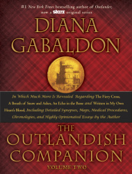 With the assurance that, "Don’t worry, you won’t have to do a thing!" (You should never believe people who tell you this, btw…), we said OK. And immediately I was presented with dozens of art samples and urged to pick 5-8 artists whose work I liked, because (of course) they had to start work instantly with multiple artists, in order to get the book on the market at the same time as THE OUTLANDISH COMPANION, Volume Two, aka "OC II" (which goes on sale October 27, 2015). So I did that, and we were off to the races.
I don’t recall exactly how many illustrations there are, but lots. And I had to look at and comment on or approve (or at least let pass) every damn one of them, in multiple iterations from sketch to lo-res to hi-res finish. I can’t complain about this; naturally, if something’s coming out that has to do with my work, I want to at least see what’s going on. (And I knew there would be a wide-spread assumption that I had personally approved, if not actually drawn, every picture myself.)
Most of the illustrations are really good; some are spectacular; almost all of them are decent. A few of them don’t appeal to me personally, but are a matter of personal taste and preference. And if the price of quality is being peppered with incessant daily emails saying, "Look at this and tell us what you think by tomorrow morning because (of course) WE HAVE TO GET THIS DONE RIGHT NOW"…well, so be it.
(If any of you have noted the lack of #DailyLines (excerpts of my new book) in recent months, it’s because I have been simultaneously doing the production phase of the OC II (there’s a post downstream that details exactly what goes into this process; let’s just say it’s kind of time-intensive), writing a script for Season 2 (that’s done; now in the iterative notes/revision phase), traveling for one event or another, and… this. As I point out with tiresome regularity to a huge number of people—and to no effect whatever—there’s only one of me. )
So we got it pretty well under control. The editorial people conferred with the design people and came up with a good idea: since (apparently) people who are into coloring often like to detach a particularly well-done page and frame it or give it to a friend, they decided to make the book with each illustration on its own page (not with another illustration on the back of it, I mean), and put a brief quotation from Outlander on the facing page. Very nice. I read all the quotes chosen and approved of them.
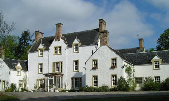
So the book is mostly wrapped up—just minor last-minute adjustments (like my noticing that Claire’s wedding ring was on the wrong hand, "goldeneye" was misspelled, or pointing out that the middle chimney on Lallybroch was apparently running straight down through several windows and the front door (this was an artifact of the drawing having been based on the Ord House Hotel —a completely period-appropriate structure — which has just such a chimney-stack (above), but theirs is an ornamental stack, and not actually the top of a working chimney. I know this because I’ve stayed at the Ord House Hotel, and recognized it from the drawing)—and then…
Along comes The Cover. I hesitate to ascribe any sort of covert motive to editorial, art, or marketing departments in general, but I will say this isn’t the first time that one has sprung cover art on me with the announcement that they hope their suggestion is OK because THEY HAVE TO GO TO PRINT RIGHT NOW (or in some minimally urgent time frame). If I were a suspicious person, I might think that the intent is to panic me into accepting something that they want but are pretty sure I will have time-consuming objections to. Luckily, I am not a suspicious person, so thoughts of this kind never enter my head.
Now, as I said, most of the illustrations from this book are excellent and some are really great. One or two… mmm. One of the "mmm" ones features Jamie and Claire in what purport to be their wedding clothes. (They’re great clothes, don’t get me wrong. I just mean they don’t look like the clothes worn in the show, nor those described in the book; they aren’t supposed to. The clothes are fine; the image just doesn’t have much sense of movement to it.)
Let me digress here in order to explain about illustrations of characters. Owing to the fact that Sony owns all images of the show, and the actors (not unreasonably) retain rights to depictions of their own faces, it isn’t feasible to use illustrations of characters that look anything like the actors in the TV show (this is true for the Game of Thrones coloring book, as well). To do so would involve licensing issues and permissions that would make the coloring book too expensive to produce—and therefore, the idea is to make generic illustrations of Jamie, Claire, Black Jack Randall, etc. And as there are several artists working on the book, you’ll see several different versions of Jamie and Claire inside. Most of them are pretty innocuous. (I’m told that colorers find faces boring, anyway, so don’t really care what the characters look like. We will hope this is true.)
So the editorial people tell me that the marketing people think we must have Jamie and Claire together on the cover, and owing to the tightness of time, how about using the interior wedding-clothes illustration?
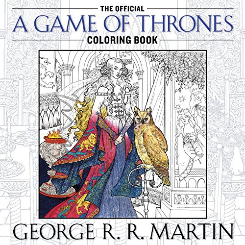
Mmmm. Well, for starters, I kind of object to anything that looks like the cover of a romance novel. Beyond that, I object to a static image with nothing happening (nothing’s happening in the wedding-clothes picture; it’s two unrecognizable people in very detailed (and very well-drawn and finely-detailed, I will admit) fancy clothes on a page. Period). And, as it happens, they’d already shown me the cover art for the GoT book. (Below.)
Now, that one has pretty good cover art. There’s a mysterious, haughty-looking woman in a long, flowing figured robe, with an owl glowering at her feet, people in the background obviously plotting behind a window, and… you know, it looks like a world you might want to walk into for a while. Stuff’s happening in this illustration.
I pointed this out and suggested (while acknowledging the time pressure) various more active images for the OUTLANDER cover: Claire taking care of the wounded Geordie at the boar-hunt, perhaps with a dead boar in the background? Jamie with sword and targe, facing off an opponent? I mean, it’s not like this is an uneventful story.
No, we can’t have wounds and gore and violence on the cover (heaven forbid…). And they were insistent that it had to be Jamie and Claire. Fine, I said. They have eventful moments, too—Claire bandaging Jamie’s shoulder at Castle Leoch? Claire sitting on Jamie’s chest after he falls off the horse?
So they agreed to have a new picture drawn, showing Claire bandaging Jamie’s shoulder (no blood visible—unless the eventual colorer chooses to add it, I suppose…), which was nice of them. "OK, cool, thanks!" I said.
Along comes the sketch. OK, a sketch is necessarily a really rough draft, and things change. This picture was well-composed and deftly drawn. The Generic Claire had a nice Da Vinci "Madonna of the Rocks" look about her. Jamie, though… Responses from a few intimate friends to whom I showed this sketch ranged from "Holy Shite! That’s terrifying!" to "He looks like a putto on crack." (NB: "putto" is the singular form of "putti," which are those little fat cherubim with curly hair floating around in the skies of Italian Renaissance paintings—not, I mean, a male prostitute.)
Cue two or three days of fuss, during which my own (flippant) reply to the (endlessly patient) art director who asked if I could be specific as to what I didn’t like about Jamie’s face was, "What? ‘Sex pervert/drug addict’ isn’t specific?" (Yes, I did then follow up with a very specific analysis of feature.) Someone also suggested shrinking the two figures and pulling them further back into the frame, so as to provide a richly detailed room around them (colorers presumably like that sort of thing)—and perhaps distract attention from Jamie’s face.
Now, the only thing I’d said by way of description of Jamie (knowing that he was generic) was that I’d like him to have a "young man’s muscularity—well developed, but lean, not a bulky wrestler-type."
Here I must pause and give my thanks to the art director and the artist, who made every possible attempt to meet my objections, meet a tight deadline, and produce a great cover. It is—as I know from doing a graphic novel with a very talented artist—just not possible to transfer an exact reproduction of someone’s imagination into a solid visual medium through the agency of an artist, no matter how talented. It’s therefore really no one’s fault that we have ended up with Jamie Fraser, age twelve. (Obviously, this Claire traveled just a wee bit too far back in time.)
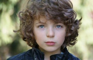 What’s rather ironic about this is that while the cover-Jamie bears no resemblance to the Jamie of book or TV show… he’s actually a dead ringer for Romann Berrux, the wonderful young actor who plays Fergus. So much for the marketing department’s desire to have Jamie and Claire on the cover…
Still, there we are! And I do hope I’ll have permission at some point to post a few of the lovely images from the interior pages, as well.
Back to THE OFFICIAL OUTLANDER COLORING BOOK’s webpage.
This blog was also posted on my Facebook page in September, 2015.
This page was last updated on Thursday, September 24, 2015 at 4:48 a.m. (PDT) by Diana’s Webmistress.
